Something old, something new
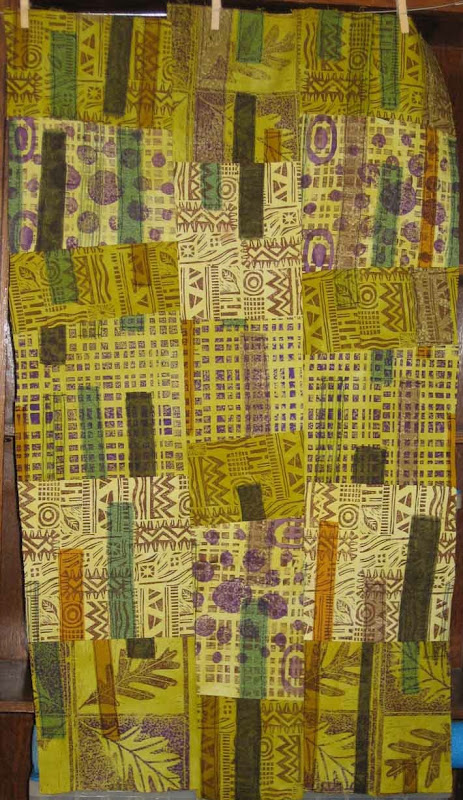
Let's start with the "new". I've really been in the mood to print lately and been having fantasies about buying a relief press. An intaglio press would be even better, but considerably more expensive. What you see here is a pieced composition that started as a single sheet of white muslin onto which I fused torn strips of cloth (commercial and hand-dye). That got hacked into 5 strips and printed in brown and purple using a variety of blocks, stamps, and plates that I've created over the last few years. Each strip then got dyed in a different value of a color gradation of green. Then came topsitiching on the fused pieces, some more chopping, resewing of the strips in to a whole cloth, and finally chopping and resewing that. I like the way it turned out. At each step I gave myself specific design limitations (color palette, type of stitching, geometric form, etc.) and forced myself to resolve the design issues within those limits. For example, when I was cutting I said that cuts could be off of orthogonal, but no strong diagonals. I think that the composition is well along, but I'm letting it rest on the studio wall for a while as I contemplate the quilting layer and what that might bring.

Now onto the "old". I should really string this out to more than one post, but what the heck. I dyed, and pieced this quilt top over a year ago and it's been languishing at home waiting for whatever comes next. This week I took it into the studio and hung it on the design wall to get a better view of it. I really can't do that at home.

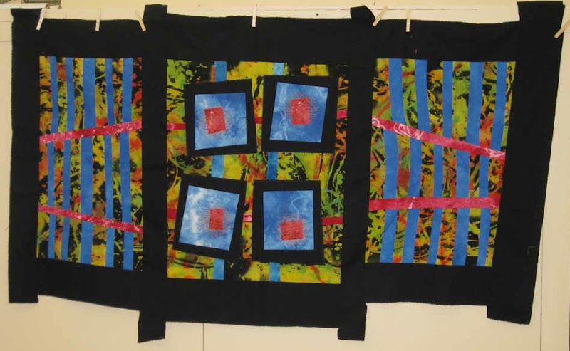
The piece started with a length of discharged and over-dyed black rayon. It was great before the over-dye, and I should have left it alone--story of my life. I went into the piece with the intention of creating a triptich form (three panels). The give in the rayon allowed me to add subtle curves to some of the straight lines and throughout the composition I intentionally played with angles. (I truely CAN sew two seams at a right angle--I swear.) The working title was "Common Ground", but I'm no longer sure that applies. It is somehow more about space. The two side panels, with their strong grid pattern seem like gates to me, which was an intentional play on the idea of a triptich, but the way the red lines are angled toward convergence points on the outer edge of the composition almost creates an illusion that the panels are bent backward, rather than out toward the viewer (particularly on the left). The tabs of black border fabric that extend from the top and bottom are just leftovers from piecing that didn't get trimmed away. Left as they are they give the piece the feel of a japanese screen. I now think they are an important part of the overally feel and plan to leave then on. I had a long informal crit session with my studio-mate, Tom, which was very helpful. I'm now considering ways that I might extend some of the design into the black border, perhaps using stitching.

