Thoughts & news
Elements of Design: Day 10 (the end)
While the sun has yet to set on Columbus, it has indeed set on my 2-week design adventure. I got to the Barn early-ish this morning and finished yesterday's composition--gluing down loose pieces and making a few tweaks here and there. David gave a short slide talk about his own recent work, and we did one last crit. Then, after lunch, slowly but surely, folks began to leave. Slow leave-taking, especially after having spent so much time together, is like slowly tearing off a bandage. It might be better if a bell rang, we all said our goodbyes, and then ran--one big "Ouch," rather than so many little painful partings.
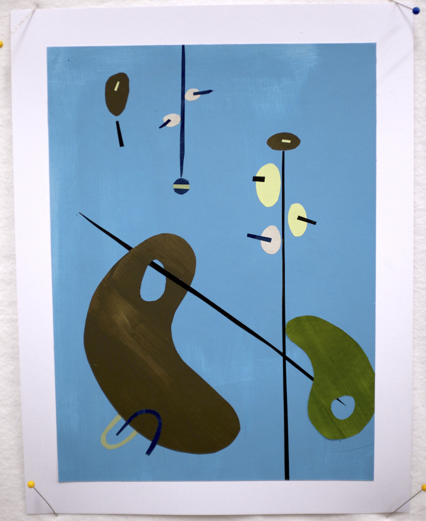
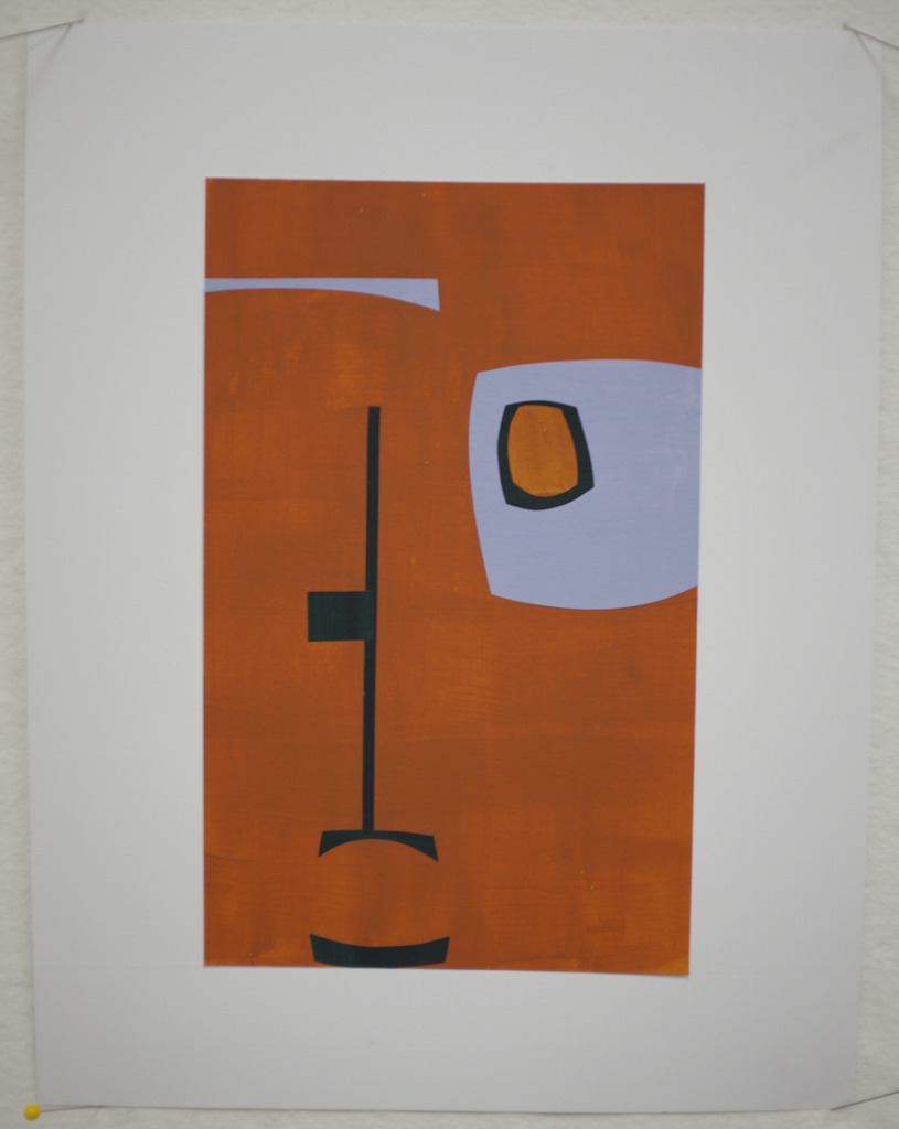
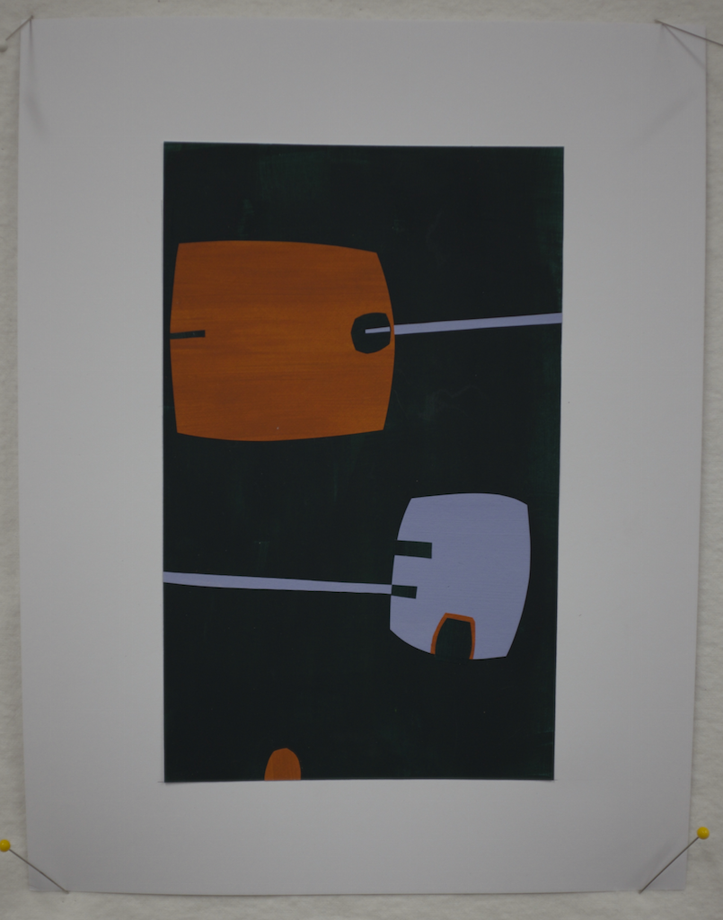
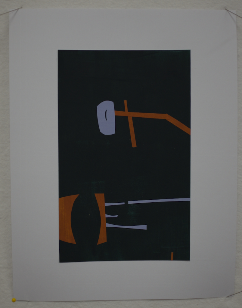
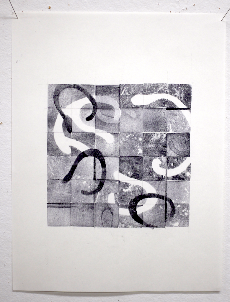
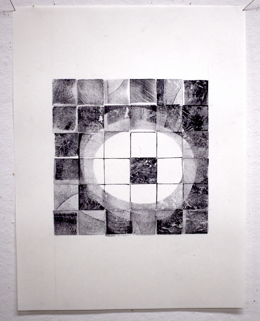
I was among the last to leave because my flight isn't until tomorrow. I did one more small composition in the afternoon as I reflected on yesterday's film about Ellsworth Kelly, seen below in by portfolio. I felt that I just needed to park this idea for future consideration.
I'm going to need to take some time to reflect on my takeaways from these 10 days. I definitely learned. I hope that I can make (and keep) a commitment to doing more thumbnails and studies. I also need to give serious consideration to paper and paint in addition to cloth, if for no other reason than it seems to access a different part of me--a different voice.
And so, I'll close with a few thoughtful photos.
Sometimes messy workspace can be productive. (it got even messier than this)
Sometimes (often) beauty exists right beneath your feet. We just need to take the time to notice.
Sometimes the shadow of a thing is even more interesting than the thing itself.
Elements of Design: Day 9
Today was probably (definitely) not the most productive studio day, but it was certainly active. After a bit of work time this morning, we did critique for 90 minutes. After lunch we had a little field trip to visit Nathaniel and Michelle Stitzlein in their home/studio--the former Grange hall in Baltimore, OH. You have to check out their site and see their amazing work on their website.
So, then there was a little more time for work, followed by an excellent film about Ellsworth Kelly ("Ellsworth Kelly: Fragments"), which I highly recommend. If you have any interest in modern abstract art, run, don't walk, to stream this on Amazon. It's an hour of Kelly discussing his evolution as an artist as well as visiting some of his larger installations.
And then I got about 30 minutes to work before we trooped off to see Nancy's (Crow) new studio. It's a barn big enough to hold a barn! The interior is stunning--all locally milled wood, huge design walls, an entire floor for quilt storage, and her husband John has the entire basement level for his wood shop. I count myself lucky to have seen the space before she moves in, at which time it will be off limits to everyone.
It was a great day, but introverted me had a little more stimulation than I needed between all of the activity and the level of energy it brought out in everyone else.
I did manage to at least start a new composition. I'm trying to do this one in 4 panels with the intention to join them, but along the way also trying to create compositions that could stand on their own. I'm not sure I can pull that off, but it's an interesting experiment.
This is where it stands so far. I keep producing this stuff that's incredibly narrative compared to any of my other work. This only comes out when I work in collage...and I'm thinking maybe I need to do a bit more of that.
Elements of Design: Day 8
In case you're wondering how long this is going to continue, it's 10 days total, so just 2 more entries after this one.
We started the day with a slide lecture on the categories of design (hierarchical, etc.), then, as promised, we spent the rest of the day much as we did yesterday--only bigger. Today's composition was 8.5 x 22". While I could have also worked 11 x 17", I chose this shape and aspect because it's radically different from my usual work.
Once again, we began with a restricted shape vocabulary and limited color palette, then added both shape and color in three distinct layers. With each layer, the goal was to create a composition that could stand on its own.
You can see the three phases of my composition below. I was surprised by how anthropomorphic and narrative the shapes became. Also, increasing the size of the design space really drove home the importance of proportion. It isn't enough to simply scale up the size of shapes from a smaller composition to a larger one. Neither is it sufficient to use the shades from the smaller composition in a larger one at the same scale. There's a sweet spot in between.
Tomorrow I'm working on a contiguous design in 4 panels that will total 17 x 22".
Elements of Design: Day 7
I'm energized, I'm learning, but I've got to say that it's Tuesday and I'm already Wednesday-tired.
The shape exploration continued today. The compositions got larger and more complex, and there was a twist. First David asked us to create 2 compositions using the same rules as yesterday (limited range of shapes, etc.), but using 4 colors. Not a huge challenge, and I was pleased with the results, shown below.
Then came the challenge: pick one composition and add to it to double the number of shapes and colors. I was hesitant at first because I liked the results that I'd already gotten and feared the mess I expected to make. I have to say that this turned out to be a great exercise. It really drove home the point that good design is built on a strong foundation. Limiting the variables (shape, color, number of elements) in the first pass made it much easier to focus on basic structure. If I'd had 24 pieces moving around at one shot, I'm not sure I'd have arrived at this solution.
Tomorrow we'll be pushing this idea further: 2x the size and multiple cycles of addition. I spent the last couple of hours today painting paper and prepping for tomorrow morning.
Elements of Design: Day 6
Dan and I had a wonderful weekend together, but this morning it was back to the Barn for week 2 of Elements of Design. David gave a great lecture on art paradigms and their historical context, which helped put our work these two weeks into context.
Today's exercise was shape composition in color. We were presented with some basic ground rules: A palette of 3 colors, a consistent bounding size, and a limited range of shapes. It might seem hard to believe, but it took 10 hours with a couple of short-but-not-hurried food breaks to complete the work below. Part of it is just the time required to paint all of the paper, then the gluing is a bit fussy time-consuming. But, I'm happy with the result, I'm applying the design principles more readily, and I feel like I'm getting my groove back.
Tomorrow morning, more colors and a bigger design frame.
Elements of Design: Day 5
This is getting harder, but I guess that's good. Perhaps it's also true that I'm getting tired. Today's exercises focused on the interaction of shapes with each other and with the negative space. The assignment was to make a series of 7x7" compositions using just 3 shapes in each, being mindful of interaction with the perimeter of the design space, varying shape scale, carving out lively negative space...the list went on.
So, here are some of the results, none of which met with particular critical acclaim. I'm trying to be mindful that there's often more to be learned from negative feedback than from praise. But, there's also a little, but rather insistent, voice in my head saying that it's very good to please the teacher. This is not the most helpful of my many internal voice.
The image below shows my first angular composition, which I tossed on the reject pile, only to be told later that it was better than my second attempt.
Here's that second attempt. I believe the feedback was along the lines of, "tight, static, vacant, and predictable." Ouch, but not inaccurate.
"Leaden," was the word for the following image. I'm struggling a bit with proportion. I love the quality of the curves, but I understand the comment. At least he didn't say, "phallic," which was not my intent.
I'll spare you the rest. Let's just say that I've got room to grow, and that's what next week is for.
For now, Dan is here. He arrived last night, and we're going to spend the next two days playing, eating, shopping, and relaxing in and around Columbus, including a trip to Athens tomorrow to see the Quilt National show. It's nice to be physically present in the same place at the same time. Between his travel and mine we've seen each other about 36 hours in the last 3 weeks.
Elements of Design: Day 4
As promised, today we began our discussion of shape, but not before a morning spent almost entirely with that same blasted 1X1" stamp. There's something to be said for deeply embracing the tool at hand--or in this case the one provided--but I'm really done at this point.
I started out revising my last piece from yesterday after consulting with David. I think it's greatly improved. More importantly, I understand why it's better.
Our final "official" challenge with the stamp was to create a design that referenced a surrounding border, again emphasizing size and tonal/depth relationships. I'm fairly pleased with the result. An early version was deemed "unfinished" during a late morning critique. I feel it's adequately resolved now, but that's just my opinion (which does count for something).
By afternoon we were discussing shape and creating cut paper inventories of different categories of shapes (angular, biomorphic, and synthetic). These concepts will be the starting point for tomorrow's compositions.
We've also started painting colored paper for next week's color compositions. There's a sort of zen quality to this preparatory work: mix the color, paint the paper, repeat. Think "wax on; wax off." It was a nice end to a kind of frenetic day that included a lot of what I'll call "adult learning moments" in which we asked lots of questions and didn't always understand the answers. Let's just say that adults who are paying to learn have a strong commitment to getting what they came for.
Elements of Design: Day 3
Today's topic was pattern. You would think that repeating patterns would be a walk in the park for a group where most everyone works in some sort of quilted textile form. Not so. Most of us made a few traditionally pieced quilts then followed our natural inclination away from that sort of structure and pattern. There was a good bit of grumbling today. But, this is supposed to be about learning to solve design problems.
All day we worked with a single blank 1x1" stamp. The first exercise was to develop a series of 4x4 patterns, pick the "best," and use that to build a 3x3 regular repeating pattern, including some combination of overlap, light, dark, and mid-tone values, and masking.
I'd rate my result as so-so.
The next assignment was to build an irregular pattern. I think that my result is only only subtly irregular. And, I can say that by now I was starting to not like being constrained by this particular 1x1" tool.
To the relief of all, our final assignment was to continue working with the same 6x6 grid of 1"squares and begin layering, using the grid as a foundation with which to interact. My two efforts thus far appear below. The second is definitely the more successful of the two. I think there will be time for one more run at it tomorrow morning before we move on to the next topic: Shape.
Elements of Design: Day 2
Today we continued our exploration of line, with emphasis on using line to build structure.
This is what I was thinking yesterday. They look like root forms, and I'm completely in love with the quality of the fine lines.
This morning, switching from ink to charcoal and pencil, we produced another round of line studies. The study below shows the same branching structure that I've been fiddling with in a combination of ink, pencil, and charcoal. The same branching structure is there, but it's simplified.
By afternoon we were working on creating thumbnail ink sketches of structures built from lines. A couple pages of these resulted in the idea at bottom right. The branching structure has simplified into sort of a budded stem.
Then we explored variations on an individual design with more thumbnails in black, white, and a mid-tone gray. Clearly some of these are better than others!
And finally, we did a larger scale rendering (6x6") of one design...
...which we then produced as a cut paper collage. I have to say that I'm pleased with both the process and the result. It's really nice when it turns out that way in a workshop, and a fine way to end the day.
At the Barn for "Elements of Design & Composition" with David Hornung
I'm in Ohio (about 45 minutes east of Columbus) for the next 2 weeks at the Crow Timber Frame Barn studying with David Hornung. Not having been an art major in school, I've never had a formal 2D design class. This is a chance to spend some quality time with a great teacher and a group of tremendously talented students focused on learning and relearning those fundamental principles of line, shape, etc.
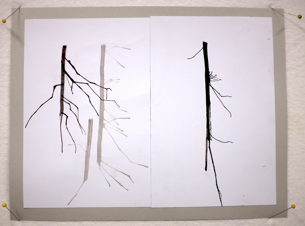
Day 1 was all about line quality and tools (stick, brushes, straws, and more). Here are two line studies. I'm hoping to bring home a nice little portfolio and a lot of learning.
Lessons from my 365: Not every design is a winner
Well, doesn't this seem like a good place to start as I consider what lessons I might learn or re-learn from my recently completed "365 Patterns" project? Just because I put pen to paper, brush to canvas, or press the shutter release button on a camera doesn't mean the result is going to be a great work. Consider the following two images. I probably spent about the same amount of time on each, but the one on the left clearly has color issues and just isn't anything too special. The on the right is better: more depth, better positive/negative space relationships, and just generally more engaging.
So, what's to be learned from this confession? I think it's these thoughts:
- Do prepare to work by taking a few minutes to clear your mind and settle your body. This is my single biggest challenge.
- Do practice, and in doing so, sometimes work rapidly.
- Do balance rapid work with slower and more contemplative work.
- Don't become overly invested in the result before the process has even begun. "I will now create a successful work of art?" is a burdensome point of beginning at best, and more often than not the first step on the road to disaster.
- Don't loose sight of the fact that at some point there's greater value in working--regardless of the outcome--than in merely contemplating the work. Spend time with your thoughts, then get out of your head and do something.
- Do value the learning that comes from making mistakes and doing work that turns out to be less than expected.
David Hornung's "Collage" workshop
It's Wednesday, and a week ago today I was in David Hornung's "Collage" workshop at the Crow Timber Frame Barn in Ohio. It was the second workshop that I've taken with David (davidhornung.com), the other being "Color: A workshop for artists and designers" back in 2009. Where the color workshop was predominantly a carefully programmed and exercise-focused experience, the collage workshop was almost entirely unstructured studio time with a general rhythm of slide show, discussion, working, and critique. We started Monday morning with a sideshow and discussion of collage as a medium and looked at examples from previous students. It was only then that I realized that several of my fellow students were "repeat offenders", returning for a second year for another week with David. He's a good and gentle teacher, and I find that he's particularly adept at creating a peaceful and contemplative environment in the studio. I think that might come in part from his own habit of working in silence. It was a real treat to work in the beautiful sunny upstairs studio at the Barn with something like a dozen people, all of whom were able to work in relative silence for hours. I confess that I went into this workshop hoping for more structured design exercises. [As it turns out, I'll be getting that in a two week design principles class with David next spring.] As a result of the open ended collage composition assignments ("Try to make 3-6 compositions per day") I was free to follow whatever path I found myself on. And, the paths turned out to be interesting. The image below show most of the work that I completed in the week. They're all small studies, but they revealed some interesting things about my thinking and aesthetic sense.
A few observations:
- In spite of my obsession with circles, when you put an Xacto knife in my hand I seem more likely to cut a straight line. I should probably be more thoughtful about my choice of tools, and mix things up a bit.
- I'm analytical about my design (e.g, straight lines, numbers, math, balance, and carefully planned imbalance).
- I really enjoy neutral backgrounds.
- The drawn line combined with the cut/pieced/collaged line is beautiful. Others do this far better than I, but I love it in almost all instances.
- Linear does not have to mean tight.
- Nerdy is OK.
Toward the end of the week, having completed so many analytical compositions, I intentionally created some very loosely brushed paper that I could cut up and rearrange. The images below show the result. I think they are pointing to possibilities--heck the whole week is pointing to possibilities.
In sum, it was definitely time well spent. Many thanks to David and my fellow collage warriors for creating such as supportive and productive environment.
I'm launching a new online series
I'm feeling the need to make a commitment to something that will feed my inner artist on a day-to-day basis. I still have a corporate job that keeps me busy most days and leaves me tired most evenings. And yet, I'm also very committed to growing as an artist. Part of that growth is keeping the creative fires stoked on days when I'm not able to be in the studio. Several years ago my friend Sherill Gross (http://sagworks.wordpress.com) embarked on the ambitious project to created a completed work for art almost every day for an entire year. The result was a wonderful series of cut paper works and an accompanying book titled, "2007 one-a-(week)day." Sherill inspires me on many levels, high on the list being her dedication to her craft.
I'm setting the same challenge for myself, but keeping it simple. I'm totally enthralled with TileDeck, an iOS app that let's you create color doodles that you can then arrange in various different tessellation patterns. It's really cool; perhaps even a little addictive. So here's what I'm going to do (at least what I'm planning to do): I will create and post one new pattern every day for the next year. That's all--just one image each day; no narrative. I just realized that I'm holding my breath and sitting on the edge of my seat as I type this. That means something. I think it's apprehension. This project won't be demanding work. On the contrary, it's going to be fun. The apprehension I'm feeling is about making a commitment to myself that I might fail to keep. But, that's casting myself a bit too far into the future. For now, let's just make a start...
You can see the daily posts here or by clicking the "365 patterns" link under "Portfolio" in the menu bar, above.
